8 Simple Tips to Improve Website Navigation for your Visitors
Team ChatSupport
August 3, 2022

What is website navigation?
Website navigation refers to the process by which website visitors explore and interact with your website.
Why is website navigation important?
Put simply; if people can’t navigate your website with ease, they’ll go elsewhere. Your website is often the first point of contact a prospect has with your brand. If that first interaction involves a lot of frustrated scrolling, why should they think your service or product will be any better?
To turn visitors into customers, you need a clean, simple website that allows for intuitive navigation.
So how do you ensure your website offers a compelling browsing experience? Check out these eight simple tips and optimize website navigation today.

1. Create a clear page hierarchy
Think of your website as a tree. Your home page is the trunk of your website. It features big, broad strokes, conveying who you are, what you do, and why that matters to the reader.
Designers and marketers used to expound the “three-click” rule, namely that a visitor should never be more than three clicks from any page on your website. That rule has since been widely discredited.
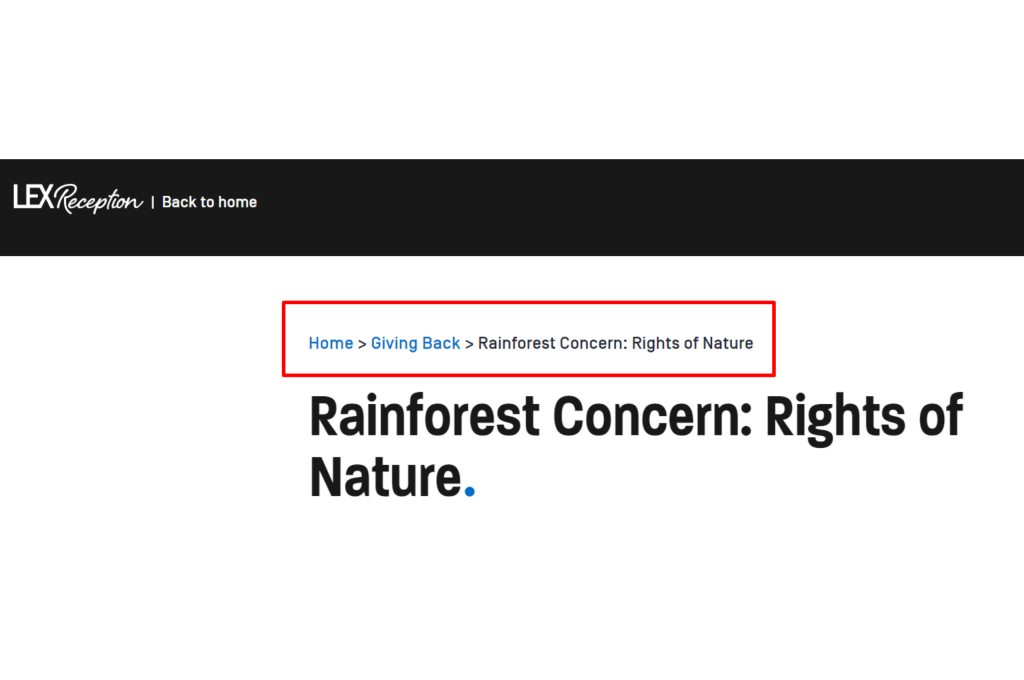
Instead, keep your navigation clear and straightforward. Add a breadcrumb trail to pages to help users keep track and maintain awareness of their locations within your website. So, if you run an eCommerce website selling household appliances, your breadcrumb trail may look like this:
Home > Kitchen > Cooking Appliances > Pots & Pans
This hierarchy should also be clear in your URL structure. And that means:
- Keep all URLs short (under 50 characters)
- Remove stop words (and, to, the, etc.)
- Ensure subpages are housed under the right categories.
Follow these simple steps to make navigation of your site easier not just for your users, but also for Google crawlers (which will help with SEO).
2. Make your navigation links clear
If a user can’t tell there’s a link on your page they’re supposed to click, they won’t click it. Likewise, if can’t understand what purpose a link serves for them, they won’t click it.

3. Clean up your meganav
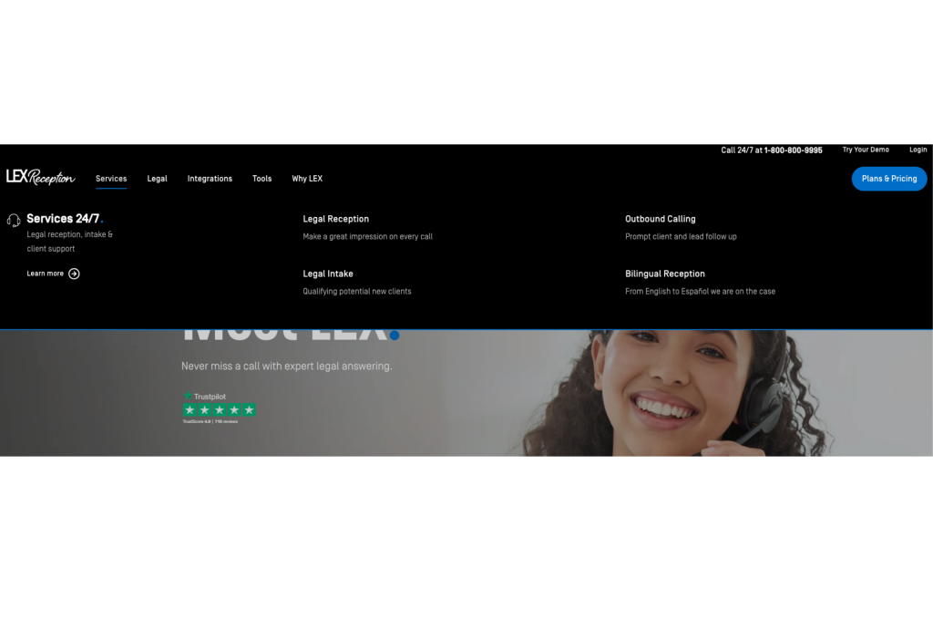
Your Website Navigation Menu is a set of links to various pages on your website. There are many different types of website navigation menus, but we’ll focus on your primary header navigation, AKA your meganav.
This menu sits at the top of your website and acts as the primary means of navigating your website. It should link to all your primary pages.
Your meganav will typically contain:
- Service/product category pages
- Customer sign in
- About
- Contact page
Depending on the type of business, you may also include a search bar in your meganav. You might also want to feature your blog here. But, unless part of your business is based on offering business advice, most visitors will likely find your blog posts through organic search. That means it may not be necessary to feature your blog in your meganav.
To make navigation as simple and intuitive as possible, experiment with a few different sections, but try to keep it to five main sections or fewer. You can include a drop-down for each, with links to other pages under each. Above all, these links should be intuitive and follow a simple hierarchy.
4. Consider design elements
Navigation is 80% design. Your design elements are also the face of your website. In other words, a cohesive design that encourages intuitive navigation is more than a ‘nice-to-have’; it’s essential. You don’t have to be a design expert to create a great website (although it certainly helps).
When considering your overall website design, focus on these four things:
Hierarchy
You want your website to be as scannable as possible. That means you want visitors to be able to tell from a glance exactly what you do, and why that matters. Every page should start with an H1 title and a header image. All following blocks of text should be broken up with H2, H3 and H4 titles. And don’t forget to break up text with hi-res, size-optimized (ie under 250kb) images.
Whitespace
Leaving plenty of space between different elements allows your website to breathe. When a website is low on whitespace, it looks cluttered. And a cluttered website is off-putting to visitors. Your whitespace should conjure focal points that draw the eye. It’s to these points you want to direct the user’s attention and prompt a specific action.

Brand colors
Your brand colors are your signature – people associate those colors with you. But that only works when you’re consistent in how you use your brand colors. Make sure they’re visible across your website, but be careful to use them in moderation.
That’s because your brand colors can actively encourage users to take action – and action starts with a button.
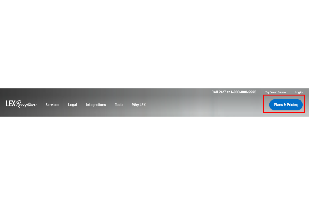
Buttons
Look at your button design – is it consistent across your website? Do your buttons use your brand colors, do they catch the eye, and do they align with the call-to-action in the preceding copy?
Above all, your buttons should be clear in what they’re asking the user to do. Your call-to-action should be the logical end result of your copy, and the button should be the element that pushes visitors over into becoming a lead.A well-placed, clearly written and color-appropriate button can significantly increase clicks.
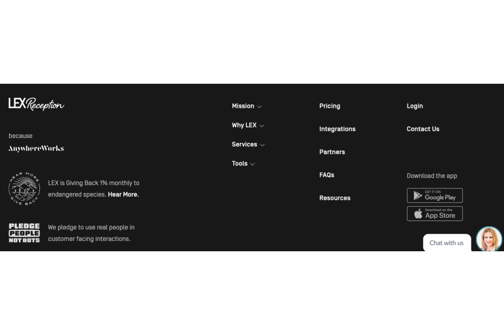
5. Optimize your footer
What is a footer?
Your footer should answer the question “Still not found what you’re looking for?” It should offer visitors who’ve reached the bottom of your page a lifeline before they jump ship. Make sure to only include quick navigation links to the most important pages on your website.
Your footer is simultaneously a Tl; Dr and a “PS” – with links to your social media channels and key landing pages. It’s always handy to include your contact details here too. Above all, your footer shouldn’t stand out. Keep it simple and think before adding any pages; will a visitor really need to see this page?
So what features should you include?
- Search bar – if they didn’t find what they were looking for, they can still search for it.
- Contact details – Make it easy for them to get in touch with you.
- Support – This could link to a portal filled with useful resources, or prompt a live chat pop-up!
- Copyright, terms of service, privacy policy – The small print. While they aren’t fun, they’re necessary, and the footer is the best place to house them.
- About the company –
- Social media icons
- Call-to-action
6. Make your website multi-device friendly
What does multi-device friendly mean?
In the push to make websites mobile-friendly, designers pushed the idea of “mobile-first” design. And it’s true that mobile is vitally important; x% of all website interactions happen through mobile.
Why is it important to be multi-device friendly?
But not all of your visitors are coming from mobile. Many still use desktops, and the number of visitors using a tablet to browse the web is growing.
Instead, focus on making your website multi-device friendly. That is, make sure users can browse your website comfortably, regardless of what they’re using to browse.

7. Give all media clear alt text
What is alt text?
Alt text is an HTML element to describe, through text, the contents of an image. Put simply, it’s the text alternative to an image or video.
Why is alt text important?
The purpose of alt text is to describe images to visitors who are unable to see them – be it because the image is unable to load, or because the person is visually impaired and can’t make out what the image shows.
Just like your business, you want your website to be accessible to everyone, right? Adding alt text is a great first step. After all, accessibility is the first step to improved navigation.
How to add alt text to your website media
Most CMSs allow you to edit HMTL elements yourself. For WordPress, for instance, you can go into the backend editor, select the image you want and type the alt text under the “Alt text (alternative text)” field.

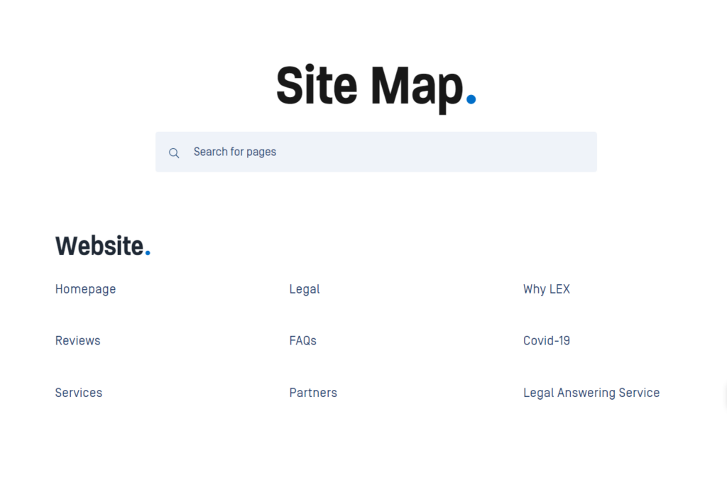
8. Add a sitemap
What is a sitemap?
A sitemap (or XML sitemap) is a structured list of all the most important links within your domain. Think of it as an aerial shot of your website, capturing the core pages that comprise your website.
Why is a sitemap important?
A sitemap allows you, your visitors, and Google crawlers to navigate your website. Your sitemap communicates a bunch of important information to search engines, including where it’s located on your website, its importance – based on the hierarchy – in relation to other pages, and when it was last updated.
But site maps offer another valuable service; they can help you make better sense of your website structure.
How do you add a sitemap?
For many business owners, adding a sitemap is an intimidating prospect. Words like XML tags, crawlers, and root folders can strike fear into the heart of anyone without a background in tech. But don’t let it put you off. With just a little know-how, you can add a sitemap to your website in no time.
- Review your website structure
- Code your URLs
- Validate your code syntax
- Add your sitemap to the root and robots.txt
- Submit your sitemap
So there you have it. These eight simple steps will go a long way to helping your website visitors navigate around and interact with your website. After implementing these steps, you can begin to explore other, more complex steps to help visitors get even more from your website.
But before you do that, why not check out the simplest navigation hack of all? Add a live chat feature to your website to help visitors find their page and guide them to the point of purchase.
Click here to download your free live chat widget and start improving your website navigation today.
Like this article? Spread the word.