The 17 Must-have Website Features For Ecommerce Business Websites
Team ChatSupport
December 1, 2021

The website features that customers expect from business websites
Whether you’re launching your first website or just giving your existing website a facelift, there are some essential web design features you have to include.
These features make it easier for search engines to rank your site for the relevant keywords your target audience is looking for. More importantly, it makes it easier for your website visitors to navigate your site and get the information they need.
In this article, we’ll take a closer look at some of the most vital features you’ll need on your website. Here’s everything you should look to include in your web design:
- Domain name
- Contact information… everywhere
- Calls to action (CTAs)
- Customers knowledge base or FAQ page
- Contact Us page
- Testimonials page
- Case studies
- Compatibility with mobile devices
- High-quality images and infographics
- Internal links
- Subscriber opt-in
- Navigational footers
- Blog with quality content
- Search functionality
- Secure web hosting
- Google Analytics
- Live chat
1. Domain name

When you visited this website, chances are you clicked a link from another website or from the search engine results page. ChatSupport.co is our domain name—and it’s what you’d type into the Google search or address bar if you ever wanted to visit our site directly (without clicking a link).
A domain name makes it easier for people to access your website. Without it, it’s just an IP address (or a series of numbers). Could you imagine having to remember IP addresses like phone numbers?!
You can buy a domain name from a domain name registrar for as little as a few dollars a year. But before you can build your website, you’ll have to pair it with website hosting. (We’ll cover that later on in this article, so stick with us!)
2. Contact information… everywhere
It’s one thing to have a designated contact form on your website. It’s another to include your contact information (address, map, phone number, and email address) in the footer and every other critical web page. Placing your contact details in the website footer means they’re visible across your web pages. And that ensures your visitors can contact you regardless of where they are in their customer journey.
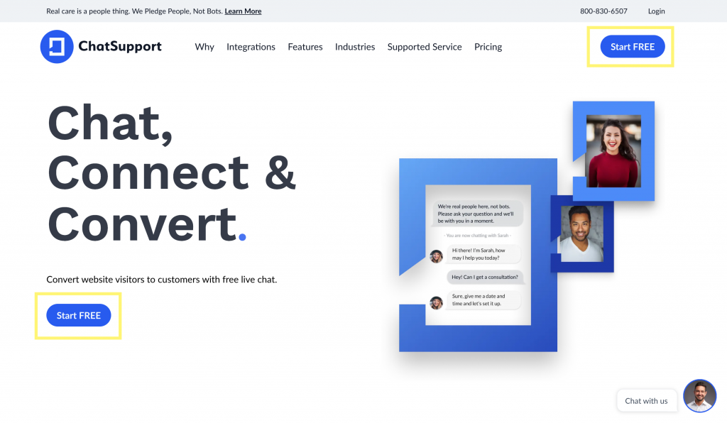
3. Calls to action

A call to action, or CTA, guides the user and provides an immediate action for them to take. This is your opportunity to tell the users what you want them to do. Want to increase conversions? Get more newsletter op-ins and sign up for your email list? Want customers to sign up for an account?
Make it known and make it easy for them to follow through!
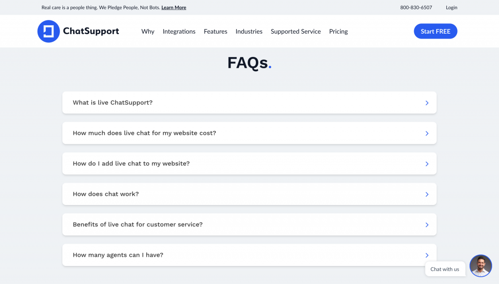
4. Customers knowledge base or FAQ page

Research shows that 73% of people like to solve a problem on their own and 67% prefer self-service rather than talking to someone over the phone. This is why you need an FAQ page or a knowledge base with guides to address your most common issues. They not only save the customer time, but they save you time as well! Why duplicate efforts when a self-service option solves the problem?
5. Contact Us page
Earlier, we mentioned featuring your contact information all across your website. Part of that includes making sure you have a dedicated Contact Us page. The Contact Us page should ideally be featured in your main navigation bar and it should include all of the ways a person can contact you, along with a form they can fill out. (And hey, a live chat window option wouldn’t hurt here, either.)
6. Testimonials page
Since 87% of buying decisions start with online research, including testimonials from current and past customers is crucial. Testimonials are a key form of social proof to help build trust with your audience! If you have a happy customer, ask them for a review or testimonial that you can share on your website. You can either curate a playlist of testimonial videos or online reviews that help bolster your overall brand image.
7. Case studies
In some industries, case studies that show how well your product or service has served others act as additional social proof to convince people to buy.
Not sure where to start? Use Think With Google as inspiration. They have a wide variety of case studies you can mimic using your clients and data!
8. Compatibility with mobile devices
Today, mobile traffic accounts for about half of global web traffic, so your website needs to look good on mobile devices, too. If it doesn’t, you risk a poor user experience and losing your website visitors to competitors. The best way to avoid this is to use a responsive web design or theme that’s compatible with mobile devices.
Pro-Tip: Use the Google Mobile-Friendly Test tool to ensure your site is mobile compatible.
9. High-quality images and infographics

Visuals help break up the text, provide context to the material you’re discussing, and are ultimately easier for the brain to process. Stay away from images for the sake of making the page look “pretty” and use the visuals to enhance the user experience. Make sure your images are high quality and substantiate your content. You don’t need distracting graphics for graphics’ sake.
10. Internal links
Your website may start out as a few simple pages, but as you add content, it makes sense to link to pages from one another. People often want to browse beyond one landing page. Adding internal links to other relevant pages allows them to do just that.
11. Subscriber opt-in
Want to build an email list to further your online marketing efforts? Add a subscriber opt-in on your site to make it easy for people to join.
12. Navigational footers

The footer is at the bottom of every page of your website. It’s commonly used for things like your contact information, subscriber opt-in, and social media links. Within it, however, you should include links to other resources such as your About Us page, your Contact Us page, FAQS, blog, and other important areas of your site.
It also helps people navigate your website and keeps them clicking when they hit the bottom of your page!
13. Blog with quality content

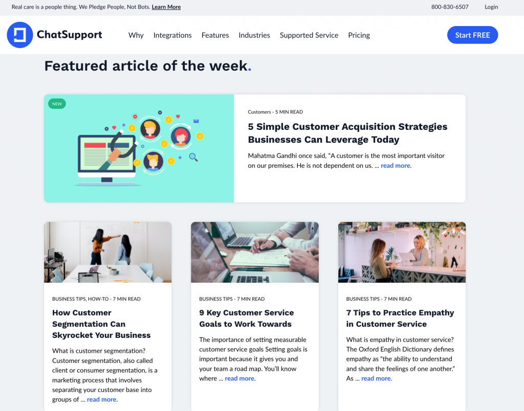
Your website is marketing collateral in and of itself. Adding a blog with high-quality content gives you a chance to add to your search rankings with every new article. And, it gives you a chance to educate your audience about relevant topics – just like we’re doing with this post.
14. Search functionality
Many users may already know what they want to find on your website; they just need a way to search for it. Adding a search bar on all pages of your site (in the header or sidebar, for example) ensures that people will be able to search whatever it is they’re looking for and choose from a list of results.
15. Secure web hosting
Your web hosting is what holds the files that make up your website. It’s what connects your domain name to the files so that when someone types in your website address, they get the web design you created.
Web hosting can be included in many web design platforms, such as Shopify, or it can be purchased separately if you plan on using a platform like WordPress to manage your website.
Not all web hosting is created equally, though. For it to be secure, you must be sure it includes an SSL certificate (secure socket layer certificate). That’s what puts the s at the end of HTTPS. It encrypts data as it moves between your hosting servers and the user’s computer. It’s also one of the factors Google uses to determine search engine rankings. Many of today’s web hosts will include an SSL certificate for free or a nominal charge.
16. Google Analytics
Google Analytics is a free tool that helps you see information about the people visiting your site. Once you set it up, you’ll get a code that you add to the <head> section of your website pages. Many website builders make it easy—you just paste the Google Analytics code in one place, and it will include it on all the pages for you.
With Google Analytics, you can get valuable data about your website visitors and potential customers such as:
- How they find your website (social media, search engine, direct visit, etc.).
- How much time they spend on your website.
- What device they used to browse, along with the web browser they’re using.
- The page of your website they first landed on, as well as the page they left on.
- So much more!
Something to keep in mind, though: Bots will visit your site and can skew your data. You can set up analytics to block certain IP addresses of known bots.
Pro-Tip: Analytics is one of the important features for your company website. The information it provides can help guide your search engine optimization (SEO) and digital marketing efforts.
17. Live chat

Live chat enables you to directly connect with your website visitors in real-time, promote sales and discounts, answer questions, and provide post-sale support. You don’t have to include live chat on every single page—just the most important ones. Set the chat widget to appear as a small button in a corner of your page to ensure it doesn’t disturb the user’s viewing experience.
What to avoid when building your site
Even if you can’t make all 17 of these features work for your website, you can go a long way toward ensuring a quality user experience if you avoid certain things, too. Take a look at what you should avoid in your new website design:
- Lots of different fonts: Stick to a single font, but use different font sizes and weights for headers and subheaders to make the text scannable.
- Distracting plug-ins: To help users find what they’re looking for on your site, limit plugins. You can use them to add features and functionality to enhance the experience. Don’t add a plugin just to add it.
- Too bright colors or flashy elements: If your website hurts someone’s eyes, they won’t stick around for long. Stick to contrast to make the text easy to read.
- “Click to enter”: That just adds an unnecessary step. And unless you’re selling products to an age-restricted audience, it’s an annoyance.
- Background music or audible ads: Just because you can do something, doesn’t mean you should. These things distract people from their ultimate goal and often prevent them from accomplishing it.
Add a Live Chat feature to your eCommerce site
Some website features are mission-critical, while others are nice to have. Live chat needs to be a priority, and luckily for you, ChatSupport makes it easy. Get started for free today!
Like this article? Spread the word.